一、 媒体查询(Media Queries)
@media 规则针对不同媒体类型可以定制不同的样式规则

二、如何使用media query
(1)在<link>中使用@media
(2)在样式表中嵌入@media
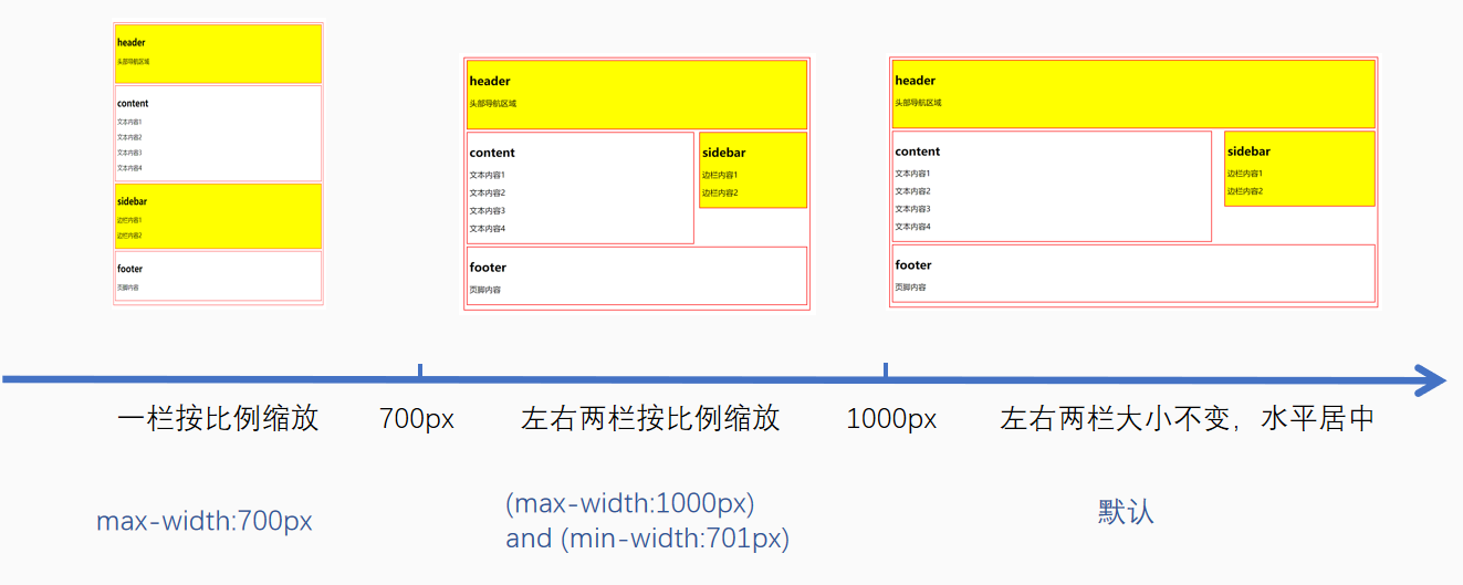
设计响应式页面的关键点是划分分辨率临界点 (重点)
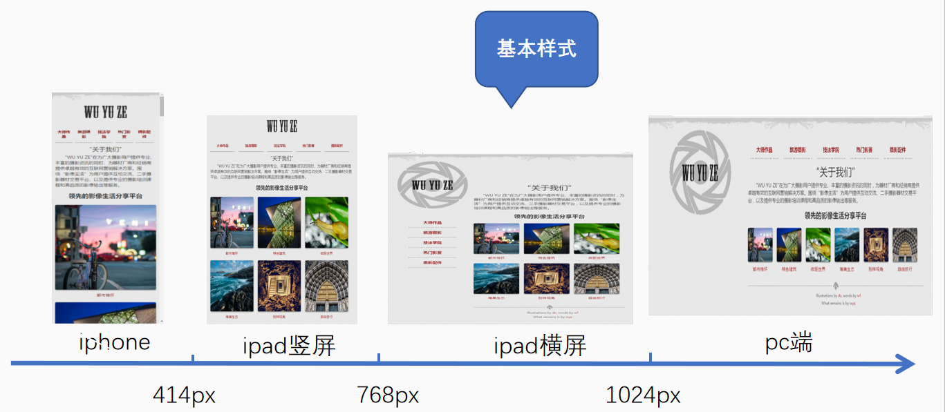
“影像分享平台” 网页制作
划分分辨率临界点
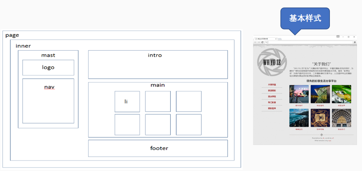
2.制作基本页面
(1) 画出布局图
(2)根据布局图编写HTML代码
<body>
<div id="page">
<div class="inner">
<div class="mast">
<h1 id="logo"><a href="#"><img src="images/logo.png"></a></h1>
<ul class="nav">
<li><a href="#">大师作品</a></li>
<li><a href="#">旅游摄影</a></li>
<li><a href="#">技法学院</a></li>
<li><a href="#">热门影赛</a></li>
<li><a href="#">摄影配件</a></li>
</ul>
</div>
<div class="section intro">
<div>
<h2>“关于我们”</h2>
<p> "WU YU ZE"在为广大摄影用户提供专业、丰富的摄影资讯的同时,为器材厂商和经销商提供卓越有效的互联网营销解决方案。围绕“影像生活”为用户提供互动交流、二手摄影器材交易平台,以及提供专业的摄影培训课程和高品质的影像输出等服务。</p>
</div>
</div>
<div class="section main">
<h2>领先的影像生活分享平台</h2>
<ol>
<li class="figure"> <a href="#"><img src="images/01.jpg"> <span>都市情怀</span> </a> </li>
<li class="figure"> <a href="#"><img src="images/02.jpg"> <span>特色建筑</span> </a> </li>
<li class="figure"> <a href="#"><img src="images/03.jpg"> <span>微距世界</span> </a> </li>
<li class="figure"> <a href="#"><img src="images/04.jpg"> <span>唯美生态</span> </a> </li>
<li class="figure"> <a href="#"><img src="images/05.jpg"> <span>别样视角</span> </a> </li>
<li class="figure"> <a href="#"><img src="images/06.jpg"> <span>自由旅行</span> </a> </li>
</ol>
</div>
<div class="footer">
<p>Illustrations by <a href="#">dx</a>, words by <a href="#">wf</a>.</p>
<p>What remains is by <a href="#">wyz</a>.</p>
</div>
</div>
</div>
</body>
(3)编写基本样式
@charset "utf-8";
/* CSS Document */
/*公共样式*/
*{
margin: 0;
padding: 0;
border: 0;
outline: 0;
font-size: 100%;
vertical-align: baseline;/*设置元素的垂直对齐方式*/
background: transparent;/*设置背景为透明*/
}
body {
line-height: 1;/*设置行高为1*/
background: #E4E4E4 url(../images/bg.png);
color: rgba(0, 0, 0, 0.82);/*设置字体颜色和透明度*/
font: normal 100% "微软雅黑";
-moz-text-shadow: 0 1px 0 rgba(255, 255, 255, 0.8);
-webkit-text-shadow: 0 1px 0 rgba(255, 255, 255, 0.8);
text-shadow: 0 1px 0 rgba(255, 255, 255, 0.8);
/*设置页面所有文字均有阴影效果*/
-webkit-text-size-adjust: none;
}
ol, ul {
list-style: none;
}/*清除列表的默认样式外观*/
a {
color: #890101;
text-decoration: none;
-moz-transition: 0.2s color linear;
-webkit-transition: 0.2s color linear;
transition: 0.2s color linear;
}/*设置超链接颜色和过渡效果,让字体颜色变化更柔和*/
a:hover {
color: #DF3030;
}
p {
text-indent: 2em;
}
/*设置段落缩进2个汉字的距离*/
#page {
background: url(../images/rag.png) repeat-x;
padding: 2em 0;
}
.inner {
margin: 0 auto;
width: 93.75%;
}/*设置页面核心区域居中,宽度为93.75%*/
img {
max-width: 100%;
}
/*设置图像元素最大宽度为原始尺寸的100%*/
/*分辨率768px-1024px之间的基本样式*/
.mast {
float: left;
width: 32%;
} /*左侧栏目向左浮动*/
#logo {
background: url(../images/logo-bg.png) no-repeat 50% 0;
}
#logo a {
display: block;
padding-top: 100px;
height: 162px;
text-align: center;
}
ul.nav {
margin: 2em auto 0;
width: 65%;/*宽度为父一级宽度的65%*/
}
ul.nav a {
font: bold 16px/1.2 "微软雅黑";
display: block;
text-align: center;
padding: 1em 0.5em 1em;
border-bottom: 1px #333333 dashed;
}
ul.nav a:hover {
color: #F00;
}
.section:after, ul.nav:after,.section ol:after {
content: ".";
display: block;
height: 0;
clear: both;
visibility: hidden;
}/*使用伪类的方式清除某个对象的浮动属性*/
.intro, .main, .footer {
float: right;
width: 66%;
}
.intro {
margin-top: 117px; /*使"关于我们"栏目靠下显示,跟左侧的logo的下边齐平*/
}
.intro div {
line-height: 1.4;
}/*设置行高为1.4倍行高*/
.intro h2 {
font: normal 2em "微软雅黑";
text-align: center;
margin-bottom: 0.25em;
}
.main h2 {
font-size: 1.4em;
text-transform: lowercase;
text-align: center;
margin: 0.75em 0 1em;
}
.figure {
float: left;
font-size: 14px;
line-height: 1.1;
margin: 0 3.1% 1.5em 0;
text-align: center;
width: 30%; /*这里的宽度不是固定值,而是相对值,可以实现图像随窗口大小变化而自动变化,同时也控制了每行只能显示3个图片*/
text-transform: uppercase;
letter-spacing: 0.05em;
}
.figure img {
display: block;
-webkit-border-radius: 4px;
-moz-border-radius: 4px;
border-radius: 4px;
-webkit-box-shadow: 0 2px 4px rgba(0, 0, 0, 0.5);
-moz-box-shadow: 0 2px 4px rgba(0, 0, 0, 0.5);
box-shadow: 0 2px 4px rgba(0, 0, 0, 0.5);
margin: 0 auto 1em; /*左右居中,下方1em */
}
.footer {
background: url(../images/ornament.png) 50% 0 repeat-x;
font-size: 12px;
text-align: center;
padding: 40px 0 20px;
}
.footer p {
margin-bottom: 0.5em;
}

